This tutorial will teach you how you can use basic shapes to create eye-catching illustrations and how to use gradients and different shades of the same color to create the illusion of depth. Learn simple trick that can help you add realism to your illustrations.
Click on the image to see the final version.
1. Create a new document: Ctrl + N – at 1000 x 1000 pixels. Hit G to select your gradient tool and choose a light blue for the foreground color (#edf8fc) and a slightly darker one for the background color (#ccedf9). With the gradient on linear, drag diagonally from the upper right corner to the lower left corner.
2. Make a new layer. With the Elliptical marquee tool, make a circle that’s fairly large. Pick your gradient tool again. Select a very light color for the foreground (#f9fcfe) and a light gray for the background (#e5ecef). With your selection still active, make a gradient diagonally in the same direction as before. Deselect. Rename your layer “Rim” – this will make the rim of your glass. Then, click on the layer, hold Shift and click on the Background layer. With your Move tool active, center the two layers by clicking these icons:
What this does is it positions the circle in the middle of your canvas.
You should have something very similar to this:
3. Ctrl + click on the Rim layer’s thumbnail to select the non-transparent pixels. Go to Select > Modify > Contract and type in 20 pixels. Hit Ok. Make a new layer and pick the gradient tool. Set your foreground color to #e7eef1 and your background color to #ebf7fd and make a gradient diagonally just like before. Rename the layer “Glass walls”.
Note: what’s the logic behind the choice of shades? When you made the first gradient, you set up also a light direction: the top right corner. Therefore, the top right corner of the glass rim will get the most light, while the top right visible portion of the glass walls will be shaded (it is on the inside), and the opposite will be lighter. (Btw, to make life easier, we’ll consider our glass to be frosted, not transparent).
4. On a new layer which you can name “Bottom”, create a new circle. Make it about 300 px in diameter, but you don’t have to be precise with this. Set #dde9ee for the foreground color and #e0f0f6 for the background color and make a gradient just like before. Deselect. Then, click on the layer Bottom, hold Shift and click on the Background layer. With your Move tool active, align the two layers just like you did at step 1.
Back on the Bottom layer, hit Ctrl + J to duplicate it. Then hit Ctrl + T to bring up the control transforms and hold Shift and Alt while dragging from any corner to make the circle slightly smaller. Then, set the layer’s blending mode to Multiply and its Opacity to 20%.
5. Let’s add water. Make a new layer and create a circle that’s larger than the Bottom layer but smaller than the Glass walls layer. Name it Water. Set you foreground color to #e5f7fd and you background color to # f0fafd and fill the circle with a gradient on diagonal like before. Deselect and then set the layer’s blending mode to Multiply.
6. Let’s add some variations of hues to the water so it won’t appear so “flat”. Ctrl + click on the Water layer to select its pixels. Ten create a new layer above it. Name it “Waves”. Pick the brush tool and choose a large hard-edged brush. Draw lines by holding Shift while you paint. You don’t need to be precise with this step. Use different shades of blue.
When you’re done covering the circle, don’t deselect yet. Go to Filter > Liquify and pick a large brush. Select the Twirl Clockwise tool and drag around the surface until you distort the straight lines to make them look wavy. Hit Ok. Now, hit Ctrl + Shift + I to invert your selection and hit Delete to get rid of the fringed edge around the circle. Now you can deselect.
Lower the opacity of the layer until it looks good to you (depending on what colors you used). You can also switch the blending mode to Multiply. I used 5% for opacity.
7. Let’s create the shadow. Make a new layer and call it Shadow. With the Elliptical Marquee, make an ellipse and rotate it to go around the bottom circle, like below. Use Select > Transform Selection to rotate the ellipse. Set your foreground color to a very light gray (#ececed) and your background color to white. Fill the ellipse with a gradient diagonally just like before. Deselect and set the blending mode to Multiply.
Let’s fade the shadow a little more: add a layer mask to the Shadow layer (click on the third icon from the left at the bottom of the layers palette). Hit D to set your colors to black and white, then X to invert them, then with the gradient tool drag as indicated by the arrow below (or experiment until you lose the hard edge of the shadow in the bottom-left corner).
8. Let’s add bubbles. Make a new folder and call it Bubbles. Create a new layer inside the folder and create a small circle on it. Fill it with white, but switch the Fill to 0% in the Layers palette properties. Then, double click the layer to get to the Layer Style and fill in the settings below:
Duplicate your bubble layer a couple of times, and change its size… Place a couple of bubbles in the water like below.
9. Let’s make a straw. Create a new folder in your Layers palette and call it Straw. Make a new layer inside the folder. Create a thin white rectangle like in the picture below:
Ctrl + J to duplicate the rectangle layer. Change its color to a bright saturated red (Ctrl + click on the layer thumb to select the pixels, then fill the selection with red.) Then, hit Ctrl + T and make the red rectangle thinner. Then, duplicate the red stripe and place them like below:
Back on the white rectangle, double click it to bring up the Layer Style and click on the Gradient Overlay. Apply a gradient at 0 degrees angle, from a very light gray to white.
Now, select the three layers in the Straw folder and hit Ctrl + E to merge them. Let’s shape the straw – hit Ctrl + T to bring up the transform controls. Right-click and choose Skew from the contextual menu. Adjust the ends to give some perspective, until your straw looks like below:
Make a small elliptical selection at the top end, invert the selection (Ctrl + Shift + I), and, with the eraser tool, delete the top of the straw. This will make it look round. Then, at the large end, make a larger ellipse (the diameter should be the width of the straw at its largest end). Don’t forget, if you don’t get the selection right from the first try, you can use Select > Transform Selection to adjust it. Make a new layer on top of the straw layer. Fill the selection with a light gray (#c7c7c7). Make a new layer on top of this and create a small rectangle that you can fill with a slightly darker red than the one used for the stripes. Center it with the ellipse from the layer below. Then, slightly skew the red rectangle to give it some perspective (like you did with the straw a few minutes ago). Zoom in to make more precise adjustments.
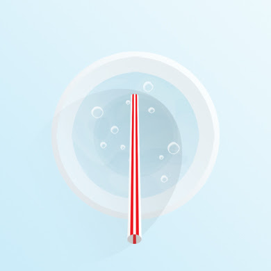
Now, link the hole layer with the straw layer and rotate them to position them like below.

10. Let’s integrate the straw better with our environment. Make a new layer on top of the Hole layer. Create an elliptical selection over the right side – and try to make it parallel with the shadow cast by the glass. Look at the picture below for reference.
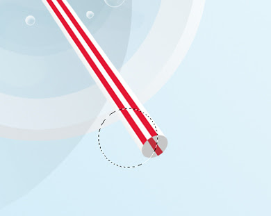
Then, hold Ctrl + Alt + Shift and click on the Hole layer’s thumbnail in the Layers palette. This will intersect your selection with the visible pixels in the Hole layer. Still on the new layer, fill the selection with #aeadad, then switch the blending mode to Multiply and the opacity to 20%. Name the layer “Shade”.
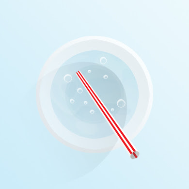
Select the Straw group in the layer palette and add a layer mask to it. We will use this to make the straw look like it comes out of the water in the glass.
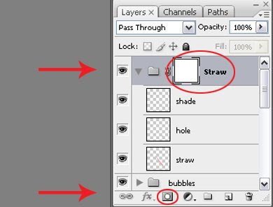
Select the transparent pixels in the Water layer (Ctrl + click on the thumb). Make sure you are on the mask of the Straw folder and fill in the selection with #b7b7b7. Deselect. Now let’s make the straw look like it’s coming out of the water: we’ll “cut” a hole in the water. Make a small circular selection over the straw like below:
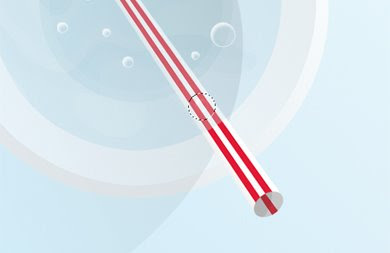
Make sure you are on the Straw mask and fill in the selection with white. But don’t deselect yet: we’ll need this exact selection later, so we’ll save it. Make a layer in the Straw folder and name it Circle Reserve. Fill the selection with any color, then click on the eye icon to switch the visibility off.
Then, Ctrl + click on the Straw layer’s thumb to select its pixels, then back in the Straw mask, pick a small hard-edged brush and paint with white to cover the area between the circle you did earlier and the edge of the glass. This is what you should have so far:
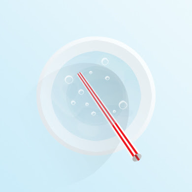
Now let’s make use of the selection we saved earlier. Make a new layer on top of Shade. Name it “Ripple”. Then Ctrl + click on the thumb of the Circle Reserve layer (it works when hidden too). Stay in the Ripple layer and apply a 2 px white stroke. (Edit > Stroke). Deselect. Apply Motion Blur at 0 degrees on a distance of 7 pixels. Then delete the part of the circle that overlaps the part of the straw that is out of the water. (Use the Eraser).
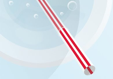
11. Let’s add a few subtle reflections: one at the water edge and one at the bottom of the glass. Select the Water layer and duplicate it (Ctrl + J). Move the duplicated layer a little up and a little to the right, like below:
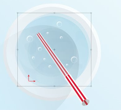
Ctrl + click on the Water layer’s thumb to select the visible pixels. Then, hold down the Alt key and click on the Water copy layer’s thumb. This will exclude the overlapping areas. Keep the selection active. You can delete the Water copy layer. Then, make a new layer above the Water layer and call it Reflection 1. Fill it with white and switch the Fill to 0%. You can deselect. Then double click the layer to bring up the Layer Styles, chose Gradient Overlay and use the settings below.
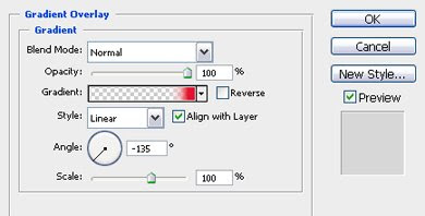
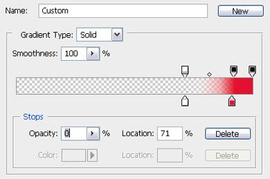
Note that the first slider is white and the opacity slider above it is set at 0%. Just play around with the sliders until you get a similar result as in the image below.
Using the same procedure, create another reflection based on the Bottom layer instead of water this time. Copy the layer style of the Reflection 1 layer and paste it on the new reflection.
Tip: if you cannot see the copy of the Bottom layer (because it’s the same color), hit Ctrl + I to invert the color. You will delete the layer afterwards anyway.
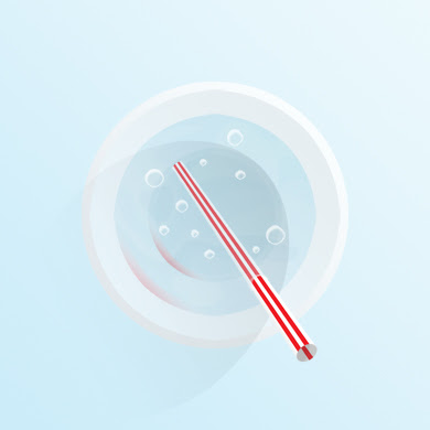
12. Let’s add a slice of lemon. Use this great tutorial from PSDTuts to create a slice of lemon, or create the circle and then cut it in half. Create the lemon slice in a separate document, then save a flat copy on a transparent background and drag it in your glass-of-water document. Place the lemon slice right under the Bubble folder in the Layers palette. Switch the opacity to 90% so it looks like it’s submerged.

The only problem now is that the straw shows over the lemon slice. We can fix this easily though: Ctrl + click on the Lemon layer’s thumb to select its pixels. Then click on the layer mask of the Straw group and fill the selection with black. This will make the straw invisible where it overlaps the lemon.

Let’s make a reflection of the lemon too: duplicate the lemon layer and name it Lemon reflection. Place it under the Lemon layer, rotate it and move it more to the left, as below. Then apply gaussian Blur with a radius of 5 px and change the Opacity of the layer to 20%. Then, add a layer mask to the Lemon Reflection layer. Next, go to the Straw layer and select the transparent pixels (Ctrl + click on the thumb). Go back to the mask you have just created and fill it in with black.

You can save your work because you’re done. Enjoy your refreshing drink!


No comments:
Post a Comment